TRASHY TUESDAY: A SELECTION OF ‘THE SAINT’ COVERS
‘The Saint’ novels by Leslie Charteris were a mainstay of the British crime fiction scene from Simon Templar’s first appearance in 1928 through to the 1970’s and even later. They were also popular in the United States, especially following the success of the George Sanders movies in the 1940’s. Charteris continued to write ‘The Saint’ novels and short stories into the early 1960’s, but after 1963 he mainly had an editorial role, with the stories being written by others under the ‘Leslie Charteris’ name.
The success of the television show, starring Roger Moore in the Simon Templar role (1962 to 1969), ensured the popularity of the books well into the 1970’s.
Over the years ‘The Saint’ novels were republished numerous times by different publishers and in different styles, although nearly all featured the famous ‘Saint’ stick figure on them. I have collected some of favourites below:

The ‘Yellow Jacket’ paperback editions of ‘The Saint’ novels by Hodder & Stoughton were quite distinctive, but tended to pale in effectiveness alongside other 1950’s editions. Nevertheless I quite like this one with cover art by the well respected cover artist ‘Jarvis’. It is a bit more elaborate than some of the ‘Yellow Jacket’ covers and the interaction between the ‘Saint’ logo and the lady with with the gun is quite nice.
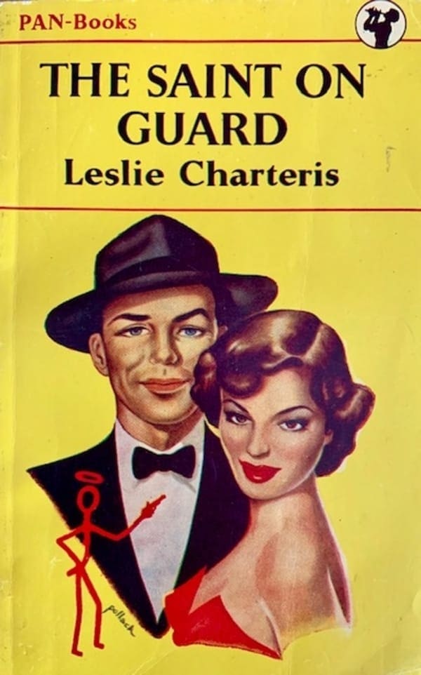
J Pollack did several ‘Saint’ covers for Pan in the 1950’s, including this stylish effort in 1951.

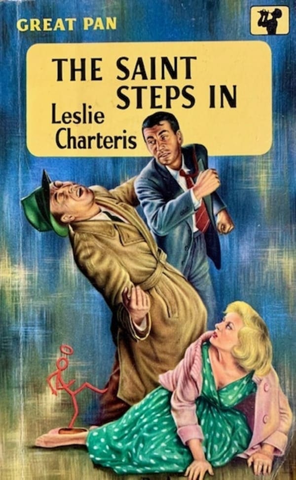
Rex Archer was also a regular illustrator of ‘Saint’ covers for Pan and he tended to bring a more action focus to them. The one for The Saint Steps In is particularly good. I really like the ‘Saint’ logo kicking the villain – a nice touch. The pink cardigan, however, seems a bit daggy!
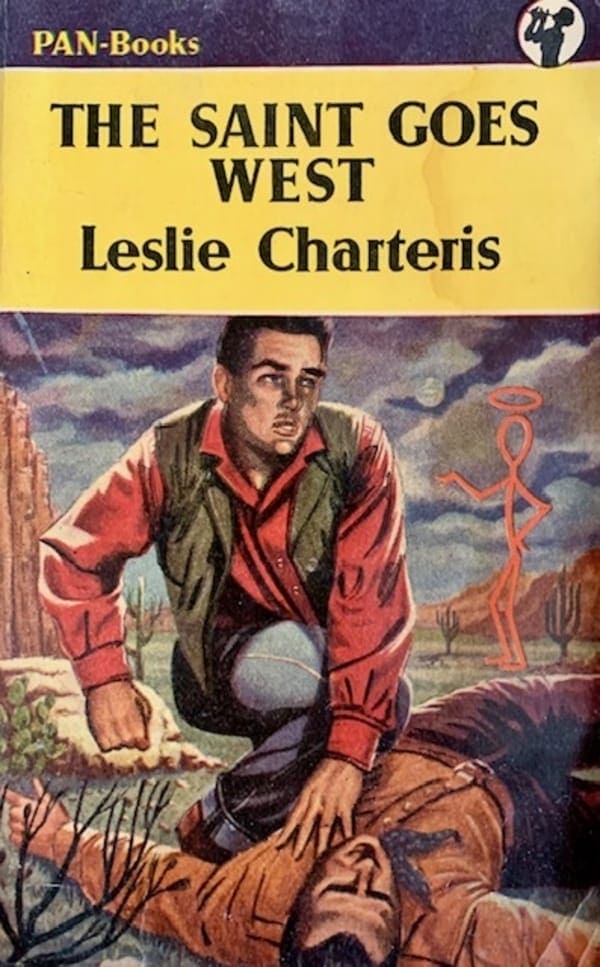
The Saint Goes West (1942) contained three novellas and involved Simon Templar in three exploits in the Hollywood and parts of the American west. The cover tries to give the book a ‘western’ feel, which was quite in vogue at the time. It is a bit generic, but is still a nice cover and minus the ‘Saint’ logo could have been used on any westerns from the period.
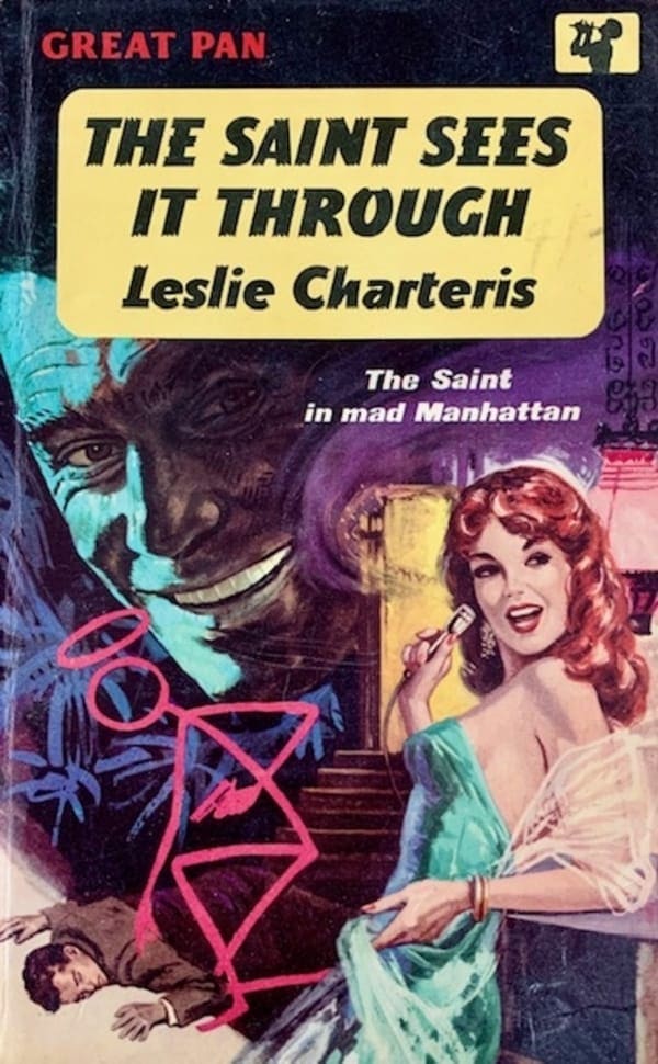
I quite like the night-life style of this 1963 edition of The Saint Sees It Through, which was set in New York.
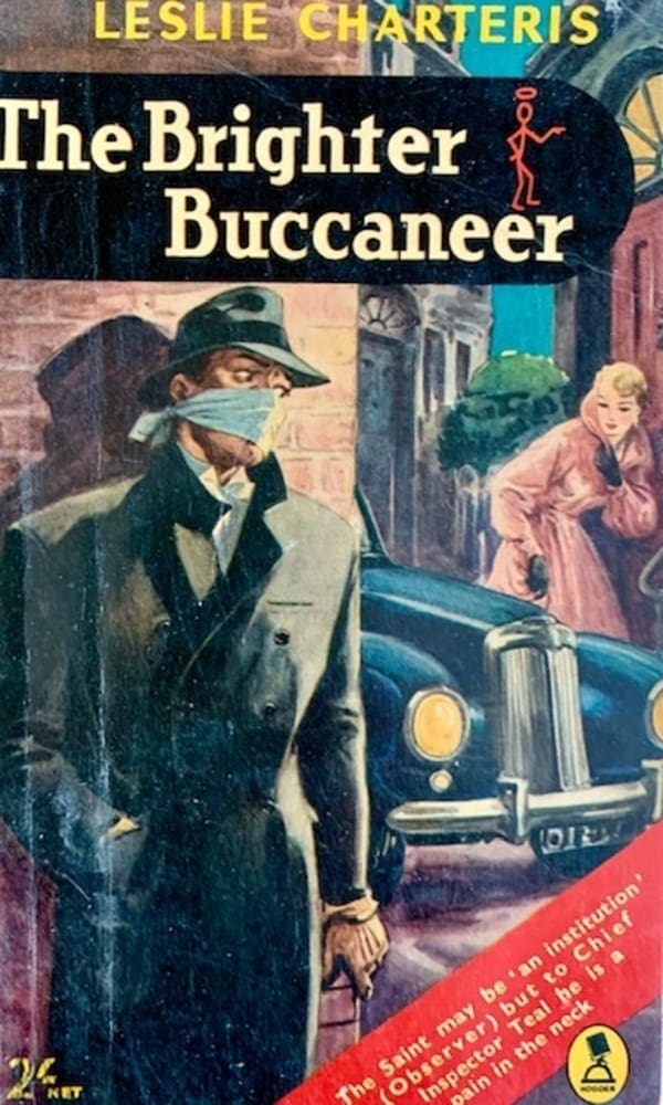
There is a good sense of muted peril in this uncredited cover for the 1956 Hodder edition of The Brighter Buccaneer. The handkerchief face mask seems a bit cheesy though. It is also one of the few not to incorporate the ‘Saint’ logo into the actual illustration.
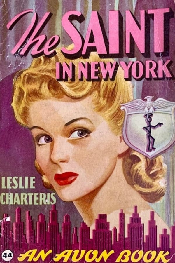
American company Avon books published a number of Saint novels in the 1940’s, including this nice copy of The Saint In New York (1944). Including the Saint logo as part of the police badge is a nice touch.
These are just some of ‘The Saint’ books in my collection. I might add another series later on.


The figures in THE SAINT ON GUARD look to bebased on a young Frank Sinatra and Ava Gardner, don’t they? Or is it just me?
Certainly a young Frank Sinatra. Well spotted. I can see the Ava Gardner resemblance, but not sure. Pollack did lots of covers like this – including a Peter Cheyney one (You Can’t Keep The Change) which was very similar.
There’s a blast from the past! Who can forget The Saint?