TRASHY TUESDAY: SAME COVER DIFFERENT BOOK #3!

In the 1950’s and 60’s British publishers frequently re-used the original American cover art work when the book was released in the United Kingdom. They also sometimes re-used that art work for totally different books (see the recent post on Badger’s re-use of the cover of Beat Not The Drums: https://murdermayhemandlongdogs.com/trashy-tuesday-different-book-same-cover/).
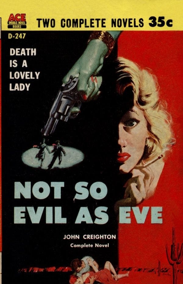
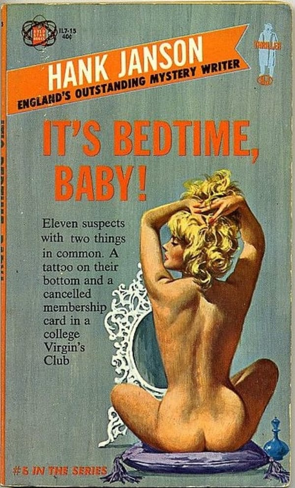
When John Creighton’s Not So Evil As Eve was released as half of an Ace Double in 1957 it came with a nice hard-boiled example of Good Girl Art by Harry Barton. Barton was an American artist (1908 to 2001) whose art work was featured on a number of magazines and pulps in the 1950s and later on paperback covers for Ace, Avon, Dell, Pocket etc. He did covers for a range of genres, including religious books, but was particularly noted for his drawings of women. One of his most notable ones is for Hank Janson’s It’s Bedtime Baby (Gold Star Books, 1964), which could easily be mistaken for a Robert McGinnis cover (see at bottom of post).
The cover for Not So Evil As Eve is quite good, with Barton making effective use of a split cover to convey suspense, lust and a good looking woman smoking a cigarette. He also gives some sense of the book’s location with hints of a desert at the bottom of the cover.
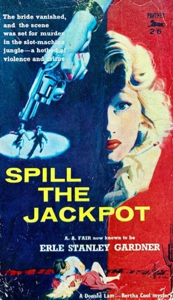
The cover was quite eye-catching and when Panther books released
A. A. Fair’s (Erle Stanley Gardner) Spill The Jackpot in Britain in 1959 they re-used the Barton artwork for it, only making minor changes to the colours.

The cover actually works quite well for Spill The Jackpot, as it captures the typical fast pace and frantic chase feel of the A. A. Fair book and also the relationship between the detective Donald Lam and the pretty girl in the book, Helen Framley. Some of the romance between Lam and Helen even takes place in the desert, which sort of matches in with the cactus and the distant mountain range on the cover.
Unlike most instances when publishers re-used cover art, the cover for Spill The Jackpot is actually a perfect fit for the story, even down to the blonde hair of the girl! The brightening of the colours, espcially the shift from black to blue in the shaded area and use of a yellow font for the book title, also helps to lift the picture and make the cover more noticeable.
In all, I think it is a very good cover and a nice example of Barton’s work.
The cover that Barton did for the Hank Janson book:


A picture is worth a thousand words ….;-)