
TRASHY TUESDAY: LARRY KENT – The Miralles Covers
The Larry Kent digests (Cleveland) went through several revamps over their nearly thirty year run from 1954 to 1983. As I have highlighted in earlier articles, https://murdermayhemandlongdogs.com/trashy-tuesday-larry-kent-covers/, the early distinctive covers were mainly done by Walter Stackpole, however, by the mid 1960s these had largely given way to less classy, more routine covers featuring semi-naked or bikini-clad young women. In the late 1960s/early 1970s this changed again when the Spanish syndicated art agency Nova Bossa started providing a lot of covers for Cleveland, including those for the Larry Kent books. Using Spanish artists such as Rafael Cortiella, Fernando Fernandez and Enrich Torres, Nova Bossa provided covers which were usually more violent and sexualised in their approach.
I recently acquired another batch of the Kent digests, including several done by the Spanish artist Josep Maria Miralles. Miralles was a self-taught Spanish artist, who started drawing comics and covers in 1953 and went on to provide illustrations for a range of British and European magazines and book publishers.
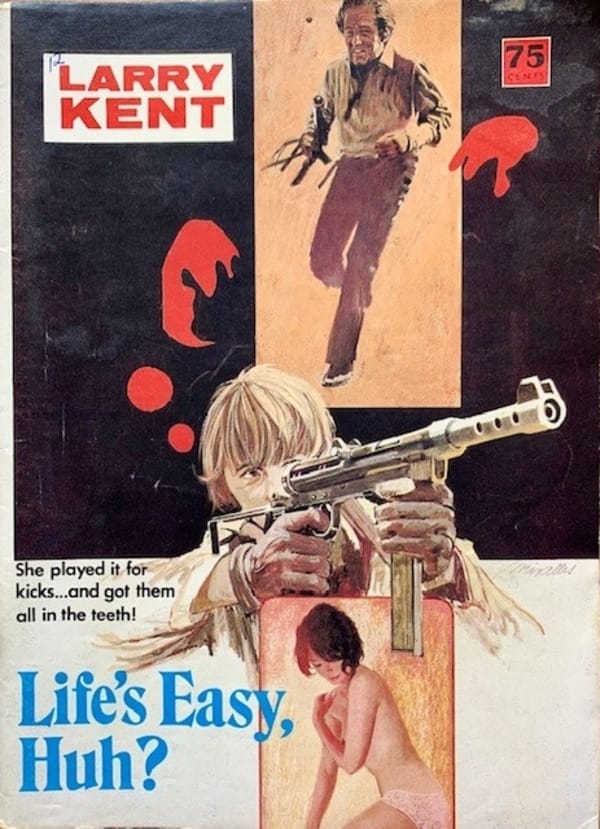
Miralles’ Larry Kent covers are quite distinctive and are usually very busy, with lots happening in the background and an attractive woman or a gunman in the foreground. Often, as with Life’s Easy, Huh? above, they seem to be a mish mash of different, not necessarily related, images! The use of scenes from popular movies was particularly common, for instance the running man above looks like it was reworked from Butch Cassidy and the Sundance Kid, even if they had nothing to do with the story. They are also a bit more raunchier than other covers from the time, if you look closely at the drawing of the semi-naked girl.
I actually like the cover from Life’s Easy, Huh? and it is easy to imagine it standing out on the news agency shelves.
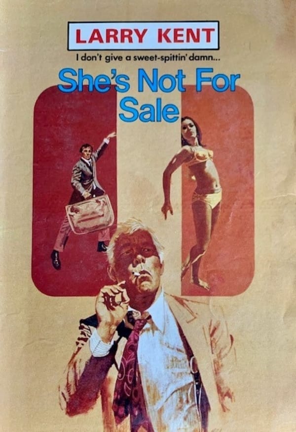
She’s Not For Sale features a smoking Lee Marvin, from Pocket Money based on the tie, in the foreground and the obligatory bikini clad girl behind him. There is also a weird drawing of a man holding a large, light suitcase and doing what seems to be a disco move in the background. I suspect that the disco man is taken from some movie, but I can’t work out which one. As with Life’s Easy Huh?, it is an odd collection of images, which presumably have nothing to do with the story.
I do like how the tag lines on the Larry Kent covers often flow into titles: “I don’t give a sweet-spittin damn….She’s Not For Sale“
A slightly different painting style, thicker, looser brush strokes on the central character, but otherwise the same sort of mixed images, albeit with a slightly psycheldic, drug feel to it.
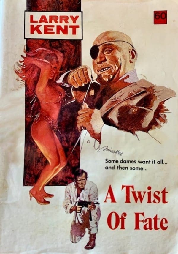
There is a strong sadistic feel to the cover for A Twist of Fate (1974), with the sneering bald, one-eyed killer juxtaposed next to the dancing girl. The cover has a strong 1970s European movie feel to me. In the foreground, the man with the submachine gun looks like Charlton Heston from The Omega Man.
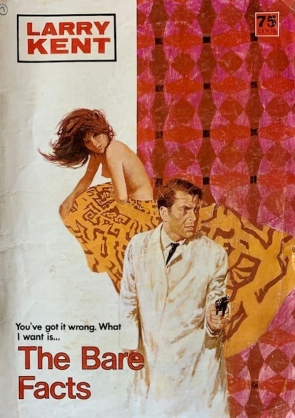
The final one is The Bare Facts (Larry Kent 820), which is a little less busy than the other covers. It does stick pretty much to the formula, however, with the semi-naked girl and the gunman in the front (Edward Fox?). It also has one of those taglines that flow into the title: “You’ve got it wrong. What I want is” …. The Bare Facts.
A couple of observations. It is interesting how many of the Larry Kent titles from this period, have snippets of what could be dialogue for their titles: Some Dame This One; Life’s Easy, Huh?; Don’t Die On Me Diana; and “Okay, Shoot It!”. They look good on the cover and presumably the conversational feel to the covers helps to draw readers in. It is also interesting that Cleveland never made any attempt to give a similar look to Larry Kent, like with the Shell Scott books in America. He basically looks different on each cover that he appears. Some of the artists repeated their version of Kent on different covers, but mostly they relied on trying to make him look like popular movie stars from the time.
I also recently got some other Larry Kent books which featured covers by other Spanish artists, such as Fernando Fernandez, which I will feature in a future article.
Thanks to Andrew Nette, whose article originally alerted me to the covers by Spanish artists: https://www.pulpcurry.com/2020/01/pulp-friday-australian-pulps-spanish-connection/
Here are the links to some articles I have done on Larry Kent: https://murdermayhemandlongdogs.com/trashy-tuesday-larry-kent-covers-2/ and https://murdermayhemandlongdogs.com/trashy-tuesday-more-larry-kent-covers/
I have I included below two other covers by Miralles, which I have previously commented on:
These covers certainly would have stood out on the shelves. I remember some of the Larry Kent novels from my aunt’s secondhand bookshop in Launceston.